We’re excited to hear your project.
Let’s collaborate!

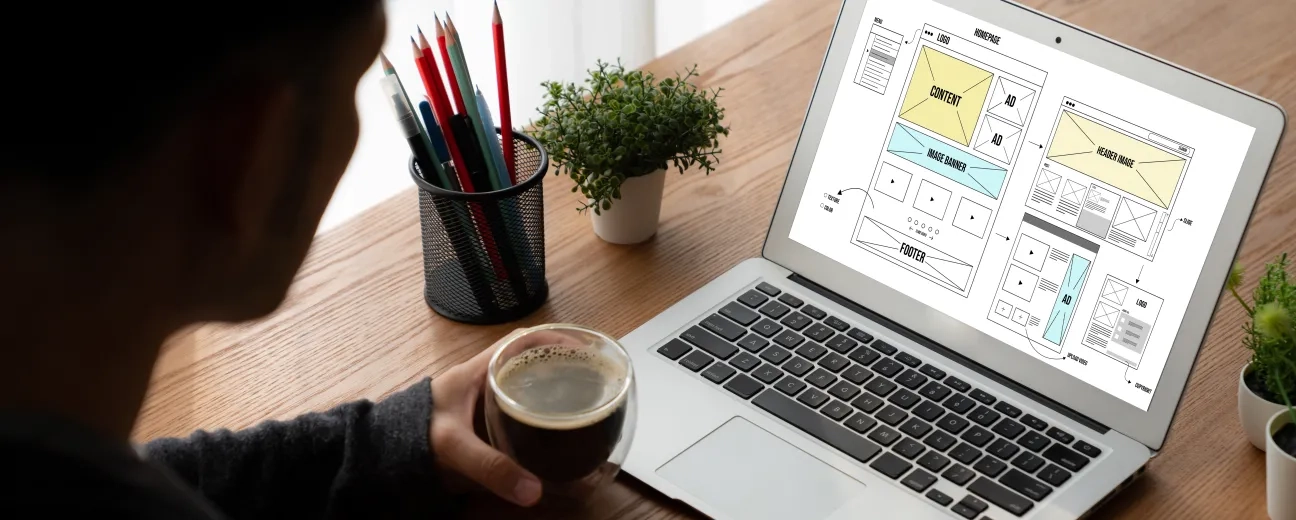
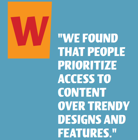
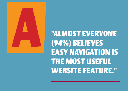
Quick and easy access to the content they're after is more important for your website users than a... visually-stunning design. Simple, straightforward navigation is what they expect to find. But what makes a website easy to navigate?
What are some good practices to follow to make your website easier to navigate?
Here's a top 11:
Don't compromise good user experience for the sake of "wowing" visitors with your innovative navigation system.

Do users expect to see a navigation bar at the top of the page? Or a navigation menu in the top right corner? Give them that.
This way, they get faster access to the information on your website that they're interested in.
Tip! Do you feel particularly creative and you want to add multimedia content to your navigation? Make it obvious to your site visitors that those are clickable elements.
A navigation bar optimized to meet the needs of a particular audience is what makes a website easy to navigate.
So, ask yourself this:
What do visitors do on your website? What are they're looking for?
More information on some of the services that you provide? Or maybe they want to have a look at the projects in your portfolio and at your previous clients' testimonials?
Are they on your website for your blog posts?
Once you're done with this empathy exercise and you have all the data, you'll know how many links are "too many" or "too few" for your navigation menu.

Source: Clutch.co
"How do I organize my website navigation?"
You make sure your sidebars don't blend in with the content on the page.
And there are many simple and effective ways that you can set it apart from the body copy. Here are just 2 of them:
How easy is your website to navigate?
Before you rush in to answer that, make sure you test it for legibility on smaller screen devices, as well.
Here 2 of the best practices to follow for legible navigation in all usage contexts:
Keep your navigation titles clear, accurate, and easily recognizable: stay away from witty or riddle-like titles.
Why would you want to change already familiar title phrases like "About Us" or "Contact Us" and risk to confuse the user? To make him/her lose valuable time trying to figure out "what the poet meant by..."?
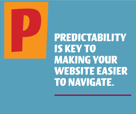
Just keep it simple and predictable.
"How do I make my website easier to navigate?"
You make sure that users can tell hyperlinks from the rest of the page content.
How?
Just make sure your navigation links are 100% usable.
Make it obvious to the users that that is a hypertext and they can click on it.

Source: Clutch.co
This is, by far, one of the website navigation best practices.
And the adjustments to consider for your mobile navigation menu range from:
Too often overlooked, the footer navigation has a big impact on the user experience (positive or negative, depending on whether you "forget" about it or not).
Just put yourself into the shoes of a user who's just landed on your website:
You've scrolled all the way to the bottom of the homepage and you now want to go to a specific service page or product page. Wouldn't it be great if you could access it via a hyperlink placed right there, in the footer? That, instead of going back to the header menu...
"But what should I put in my footer?" you ask yourself.
You can either:
What makes a website easy to navigate? Effective on-site search functionality...
Especially if you have an eCommerce website, where users look for specific products/services.
Once you've implemented it, follow these tips for making your search bar stand out:
And don't stop there:
Merely adding internal search functionality is just the first step. Make sure that the entire search experience meets the user's expectations.
And in 2020 users expect much more than just the basic product filters like color, size, and style.
They want to narrow down their selection to products that are on sale or to products that have been recently added to the website or...
Here's why you don't want to use buttons in your header navigation:
In short, use text for your menu items for both usability and SEO. It's one of the website navigation best practices in 2020.
Provide them with a map before you expect them to explore your website.
This way, you:
A win-win.
To ensure that your website meets the latest accessibility standards, explore our article on Achieving Accessibility and AODA Compliance with Drupal Development, where we discuss key strategies for creating inclusive web experiences.
The END!
With these best practices on what makes a website easy to navigate at hand... what next?
How do you implement them on your own website?
We're ready to help you create that intuitive and effective navigation system. Just drop us a line.
Image by OpenClipart-Vectors from Pixabay

We’re excited to hear your project.
Let’s collaborate!