We’re excited to hear your project.
Let’s collaborate!

"What's new in Drupal 9?" or "What are the new features in Drupal 9?"
These 2 questions are on everyone's lips these days, both Drupal teams and organizations using Drupal.
How about a... shiny new main theme?
For, let's face it: we've been longing for a new default theme in Drupal for some time now...
The current one, Bartik, hasn't got an update since... 2011 and it has started to show: Drupal 8's outgrown its core theme.
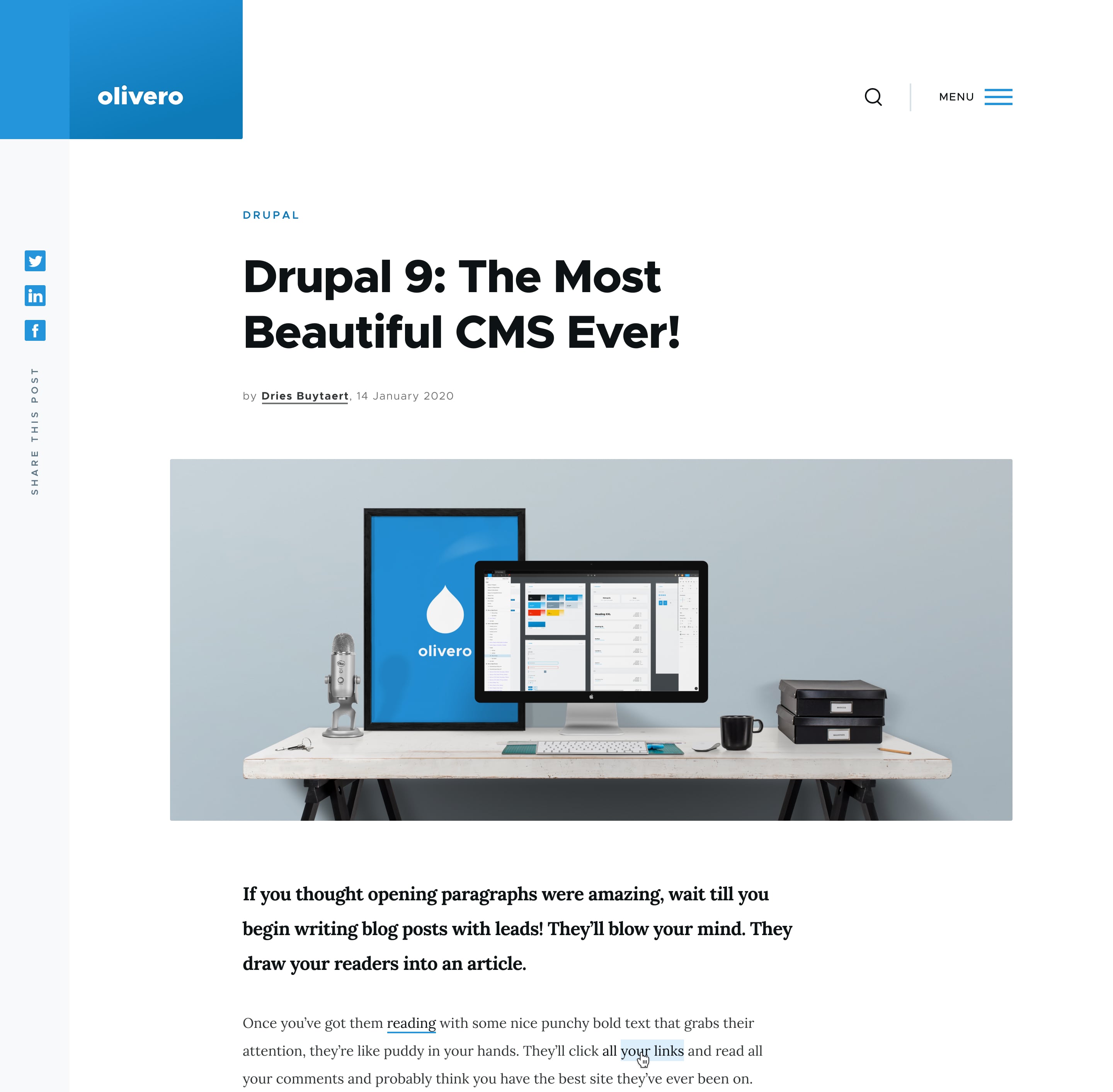
The new one, Olivero, which is still just design with a proof of concept, is expected to address all of Bartik's limitations:
But let's dig in for some more info about this initiative:
Does it resemble Bartik?
I'm pretty sure it doesn't, judging by the fact that:
Overall: Bartik has started to look a bit... out-of-fashion, while Drupal's back-end has been growing more and more robust.
Therefore, I bet that the words that you'd use to describe your "ideal" default theme in Drupal revolve around these key adjectives:
No goal no... glory.
That's why the team behind this Drupal core initiative, Lullabot, set 3 major objectives for the Olivero theme:

Source: Dries Buytaert's blog
Curious which of the features on your wishlist for an ideal default theme have made it to the list of design principles for Olivero?
Well, here they are:
"What's new in Drupal 9?" Look forward to a new, promising design system.
I'll highlight just 5 of its components, so you can get an idea of what the team behind this initiative mean by "modern" and "flexible" in relation to the Drupal 9 default theme:
Source: Drupal.org
They chose:
They used the size 18px for the base font in the body copy, to be leveled for metadata, headers, quotations, etc. and adapted to smaller viewports, as well.
Consistency, throughout line-height and spacing, has been a key goal when setting the scale for typography.
The flexibility principle is best reflected in the header of the future default theme for Drupal 9:
The news factor is that in Drupal 9 you'll have one sidebar region instead of two competing for space on the screen.
A single spacebar, next to the primary content, where your content team can display related posts and all kinds of utility blocks.
The Olivero theme will ship with background-color and width settings that you can configure in order to fit any text length and logo type.
"What's new in Drupal 9?"
I think this question is not quite accurate, in relation to this upcoming front-end theme.
"What's bound to be new in Drupal 9?" is more appropriate.
For the Olivero theme is not yet... a theme in itself, but work-in-progress.
A proof of concept, a core initiative that's still calling out for contributors. One that's expected to become the new default theme in Drupal, that should:
Why would you care for this initiative if you were a Drupal developer?
Because it would improve your entire experience of working with Drupal.
Why would you care about this work-in-progress theme if you were considering Drupal for your next web project?
Because all visually-appealing websites have one thing in common: a modern, accessible and flexible theme.
Image by Mudassar Iqbal from Pixabay

We’re excited to hear your project.
Let’s collaborate!