We’re excited to hear your project.
Let’s collaborate!

“Little things done right matter”. And there's no point denying that you, too, consider the 404 error page on your website a “little thing”. Something not worth investing too much thought and creativity into, right?
But what if you did focused on its UX? What if instead you managed to reduce the “shock” your users might experience when finding themselves stranded on your 404 Page not Found page?
What if you turned this “accident” or “incident” (that you can't 100% avoid, it happens to all of us) into an opportunity to show them that you care about little things being done right? Especially when these neglected “details” involve their own time and can affect their experience on your Drupal site?
A cleverly designed 404 error page will turn into a:
And now, without further ado, here's “the anatomy” of a cleverly crafted 404 page that won't drive users off your website from the very first second:
As online users we've “wandered” on 404 pages a few times (at least) ourselves. As Drupal site owners/developers/designers we had to face this frustrating reality: our site users landed on this “no man's land” page on our websites.
Links do break, pages get removed from our website, so “cracks” like these, where users risk to fall, do appear.
The most common causes are:

No need to “punish” your website visitors for having landing on your 404 error page! They must be feeling confused or frustrated already!
So, instead of making them feel as if they've just landed landed on a “stranded island” and simply leave them find they way out of there, how about throwing them some “ life rings”? How about giving them some suggestions on where to go next and thus keeping them on your website?
Here are the most common solutions you could rely on for turning this opportunity (that they've accessed your site) from a potentially lost one (since they're on your 404 No Found Page after all and they risk to leave your website) into a regained one:

In other words: there are plenty of quite basic and obvious “remedies” for helping your visitors find their way out of your 404 page, but not out of your website.
Just put a little effort in finding the “rescue” paths that are most suitable for your audience and your site's particularities, too.
And speaking of “life rings” to throw to your users, as you imagine them as being on a stranded island once on your 404 page, adding a search box (or even a sitemap) is such an efficient little “trick”!
Again: don't “punish” them for having had the bad luck to land there! It happens to the very best of us!
If it's your Drupal website's an old one, for instance, chance are that you removed some of its pages of redirected them. So, why not making it super easy for your visitors to just search for the pages they wanted to access in the first place?
Although opinions can vary, we here at OPTASY still prefer this solution to that of automatically redirecting your user on a different page. Let him/her be the one to decide where to go next!

And since we've used the “stranded island” expression twice already, the following “tip” for cleverly crafting your 404 error page is: don't make it look like a “stranded island”!
That's right! Aim for consistency and make sure that this particular page, too, sticks to your website's overall design guidelines! Keep the same colors, fonts and style, making it look like a component of your website and not like “the black sheep” of your site.
And, speaking of making your 404 error page not found “context-sensitive”, you should consider adapting its content the given context, too.
For instance, let's say you have a visitor landing on this 404 page from one of the category pages on your Drupal website, while trying to access a particular category page that no longer exists. In this case you could consider placing a (or several) link to another one of your popular category pages.
Adjusting your 404 error page to your site's particularities in terms of design and branding and to your users' search experience (what page your user was searching for, what page did he/she visited last before landing on your error page etc.) is crucial if you want to keep your visitors on your website!
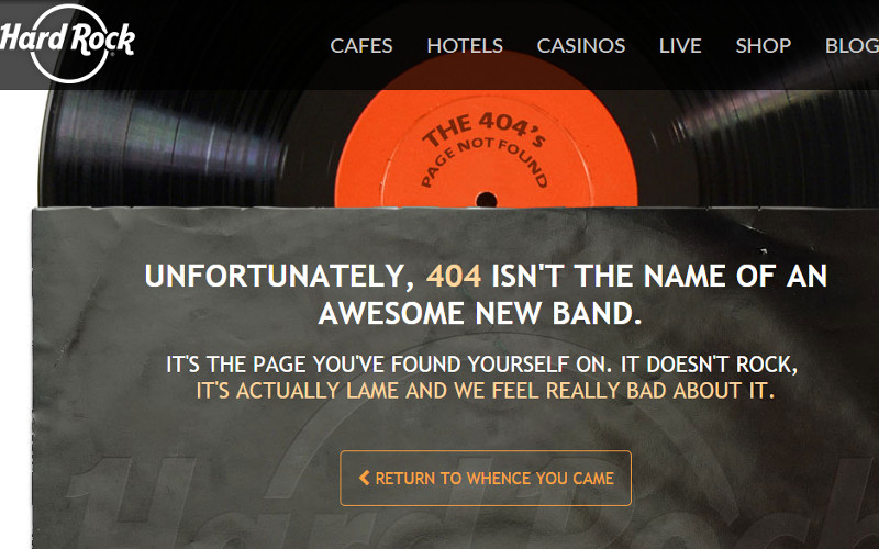
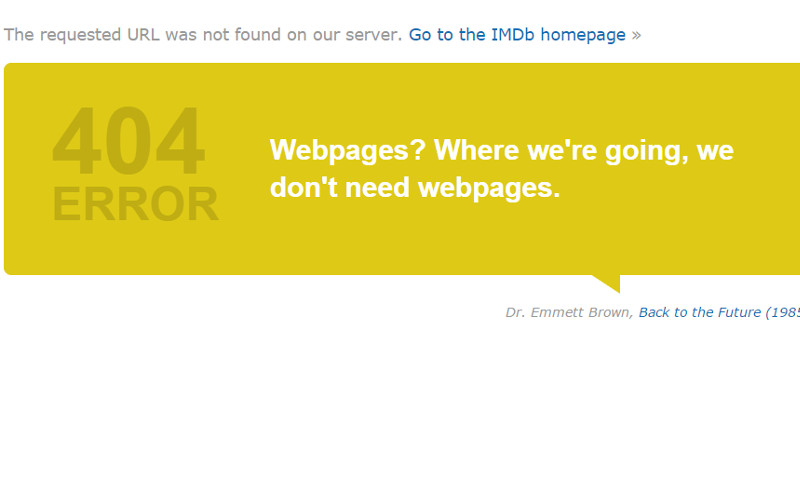
We do know that throwing in a bit of humor and adding some proofs of creativity is a huge trend in 404 error page design these days. Yet we advise you to handle humor with great caution!
Especially when it risks to affect your page's overall functionality!
First of all that no user will find it funny to have his/her time wasted as he/she has to wander on an error page.
Secondly, turning their frustration/confusion into a joke will only amplify it!
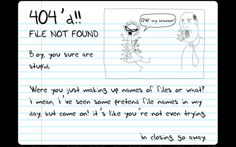
And here's a more than suggestive example of a highly “risky” usage of humor on a 404 error page:

In other words: think twice next time you decide to just throw in a video starring a cute pet or to just put a “funny” drawing on your 404 error page with no explanation of why your visitor has landed there and where he/she can go next.
Instead of aiming to make them smile, you'd better adopt a more practical approach: help them leave your error page while still continuing their journey on your website!
And these are our suggestions for you on how to cleverly design a 404 error page that should keep your users on your website. How does the “anatomy” of an effectively design error page look in your opinion?

We’re excited to hear your project.
Let’s collaborate!