We’re excited to hear your project.
Let’s collaborate!

Of course that we all know “the middle way” is the safest path to follow and yet... it's not that easy to find it or to stick to it, right? How do you know how many choices to tempt your website users with? How can you tell when content becomes “too much content” or when the delivered information is discouragingly scarce? Striking a balance, when it comes to information density is, undoubtedly, the work of a “chemist”: pouring precisely the ideal dose so that the final “potion” is, indeed, useful to your users!
There's no such thing as one-size-fits all principles to follow here. Yet, there still are some more-then-useful guidelines to consider when it comes to achieving the proper dosage of content to greet your visitors with on your Drupal site.
Ready? Here they are:
So, before we go any deeper into the whys and hows of keeping information density under control on your Drupal site, you should first acknowledge its high influence on:
How come? Well, it's pretty obvious: the amount of content that you deliver via your website, to your users (taking the form of written content, images, color, controls, textures) will determine whether he/she will keep navigating or leave your site in frustration.
Moderation is key, lest you want your heavy load of information to bog him/her down or the lack of information to drive him off your site!
Always have the USER in mind wen you create your wireframes! Web design trends and movements should come second.
A whole collection of visually-striking images... attention-grabbing videos... multiple calls to action... testimonials... rates... recommended products... super long copy... and, in this overcrowded web page (for yes, this content, in all its forms, is displayed on a one single web page) “sprinkle” some, let's say, celebrity endorsements, too!
Can you visualize this heavy-content page? Can you easily “digest” all that “virtual” content and effortlessly make your way through it?
So, you get our point: always put yourself into your Drupal site visitors' shoes and always anticipate whether you risk to deliver excessive information, to offer them way too many choices. Which will automatically “paralyze” them, instead of engaging them.
You'll end up confusing them!
“Bombarding” your users with way too many options and too much visually-distracting information for them to “digest” will only result in a bad user experience.
One of the possibly winning formulas:
Headline + An Image + A Description + The Price +A Call to Action + Some Reviews Per Product.
Now, before we go on with our list of tips and tricks, let us share with you a couple of key questions that will indicate you the right path to take for achieving... perfectly balanced information density:
There! Once you have the answers to these 3 key question, you'll step on the good path to properly adjusting the amount of the information that you'll present on your website.
And now, the promised tips and tricks for pulling off a reasonable information density:
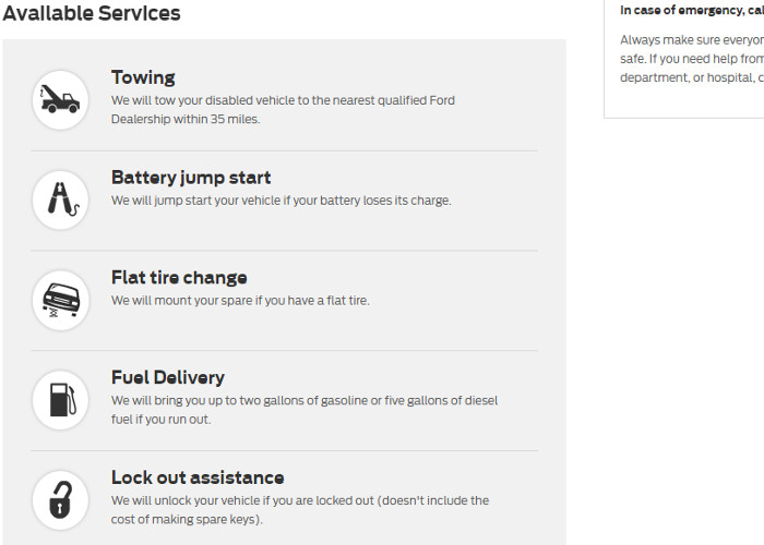
And since text without exemplifying images is like cake without frosting, take a look at this example of clean design and information structuring leading to zero ambiguity or paradox of choice:

A few elements, that clearly communicate to the user which are the company's available services = good UX!
Just because it's “trendy”, it doesn't mean that it's going to serve your site's goals of usability and navigability!
Do keep this in mind when you decide to “declutter” and to overly simplify your Drupal site's design! Less sure is more, no doubt about that! Just make sure you don't turn “less” into “scarcely enough”!
When in doubt, go for a “moderate minimalism” formula:
An eye-catching headline + The value proposition + The description + The tagline + A concise and attention-grabbing call to action!
And, as a golden rule: always consider the nature of your Drupal site, its audience and their expectations before you “blindly” adhere to one web design ideology or another.
Needless to add that if it's a magazine's website that you're working on, adding just a few “teasing” lines of text on each page will greatly affect the UX.
Surprised that we're actually suggesting you to go “against the tide”?
In fact, we're just asking you to take some time to consider these possible good aspects of an information-heavy web page:
In conclusion: what you should avoid, at all cost, is not really high information density, but poorly organized, crammed on-page content! "Clutter” will always discourage users.
High information density is necessary for certain websites (news sites, for instance), so you can't afford risking to fall into the “pitfall” of minimalist design. And not delivering the content that your visitors land on your site for in the first place.
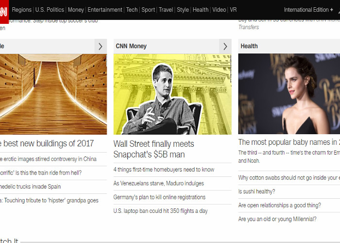
Now speaking of efficiently structuring information on a web page, take a look at the example here below: although it's a content-heavy page, you can still fluidly “navigate” trough the displayed content!

Now that we've see that high information density is something you shouldn't avoid at all cost, given the nature of your own Drupal site (if it's precisely information that your users visit it for) and that poor alignment and information “clutter” is what you should stay away from, let's discover together how you can pull if off right by using some web design “tips and tricks”:
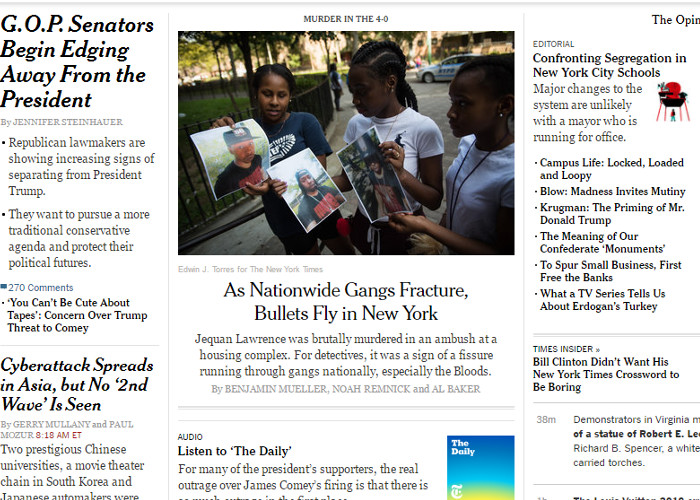
So we've tackled issues of good alignment, effectively grouping content and all kinds of web design tricks for making a content-packed web page as little mentally exhausting for the user as possible. Now let us continue with a “bad example” for supporting our “pledge” for perfectly structured, organized content. Here it goes:


We’re excited to hear your project.
Let’s collaborate!