We’re excited to hear your project.
Let’s collaborate!

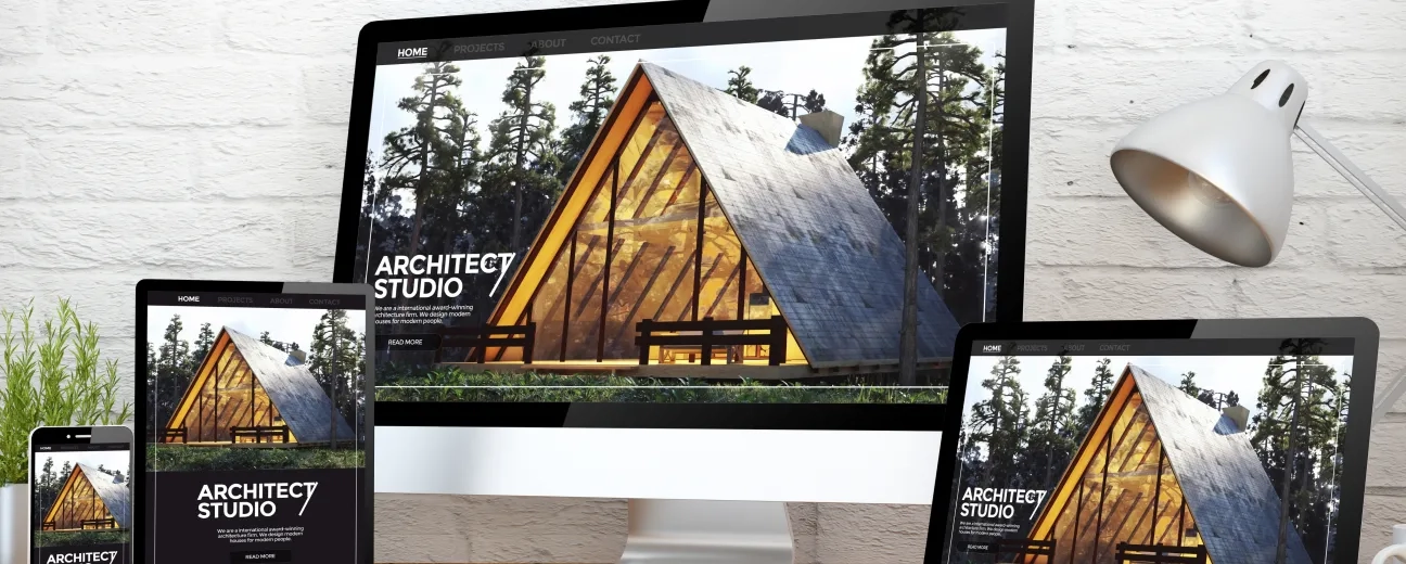
When it comes to mobile development, it’s much easier to create a brand new responsive website than to upgrade an existing website from unresponsive to responsive. That being said, the task is definitely doable if you follow these mobile development tips:
This is a list of different mobile development methods which you can use to roll out a responsive redesign.
If retrofit works on your current project or website, it’s a great option for quick mobile development. It’s definitely not a magic wand but you can definitely retrofit an existing desktop website to a mobile one in a relatively short period of time – some projects can last under two months while some can last just a few weeks.
You should definitely use a beta and have your users test it out in order to make sure you get the right results. Mobile development companies use this method to get a lot of user feedback and implement different solutions to fix potential problems.
Similar to the parallel beta method, using an existing m-dot site to experiment and gain user feedback is a great idea. The existing m-dot website can be used as a sandbox for rolling out responsive design in stages. This method was used by BBC and the Guardian to upgrade their websites, so you know you’re in good company.
With the number of mobile users surpassing desktop users, it’s essential for any organisation or company to have a fully functional responsive website to handle this new trend.

We’re excited to hear your project.
Let’s collaborate!